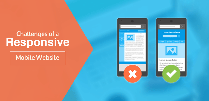
Challenges of a Responsive Mobile Website
The great shift from desktops and laptops to smartphones is itself a big challenge for the website designers. While creating an effective mobile app, the designer has to consider various factors like readability, navigability, screen resolution and etc. However, there are multiple ways to approach a mobile web presence and the most popular approach is the responsive web design.
The basic concept behind a responsive design is to build one site or app that fits all screen sizes, be it desktop, smart phone or a tablet. As a software test analyst, I am the one who is responsible for ensuring the users a consistent performance across a range of devices. Here in this blog, I will talk about how we can test responsive websites to ensure consistency.
Devise the test strategy:
Creating a strategy that is best to test the responsiveness of the site is vital and unless you have a proper testing budget, it won’t be possible for you to test every operating system, browser, device combination and this would make it difficult to identify the browsing habits of the users. At IDS Logic, we have a set of the latest handsets that are used to test the client’s website that are mostly used by their customers. We also use Google Analytics to determine the browsers and devices that influence the majority of the web traffic.
Know the differences:
Responsive design itself means changes in the design based on the different screen sizes. It is very important to remember that testing multiple template designs can be disorientating. So plan your testing process, so that you don’t have to flip constantly from handsets to desktops. There are occasions where avoiding this becomes impossible and so it is important to understand the intentions of the designer on different pages. As a test analyst, if I am short of information that I need in the project, then I ask my team to provide me with more details.
Development time:
Another big issue with the testing of a responsive design is that developers take more time to build the website for handsets. Converting an existing site into a responsive one requires considering various features and functionalities, making the task more difficult. It is only after that, the website can be thoroughly checked for multiple devices and this soon adds up time.
Navigation menus and images:
Navigation plays a crucial role in any website. With multi-layer drop down or mega menus being used for desktops, converting it for mobile devices will always encounter limited screen space and this makes designing intuitive navigation menus a challenge. Not only this, the scaling of images is also another limitation. Creating different images according to the device is a good solution, but it also has various other things to consider. Failing to test each image will often lead to a disaster.
So, if you are interested in offering a consistent user experience of your mobile website, then get in touch with us as our team can help you to properly plan the testing phases of your responsive website.
This article is very useful for website developers who want to learn or make responsive mobile website….
Thanks for sharing this….
A Very useful blog you shared for us, It’s impressive and also helped too. Thanks for sharing this post and we will try to keep touch with your site.